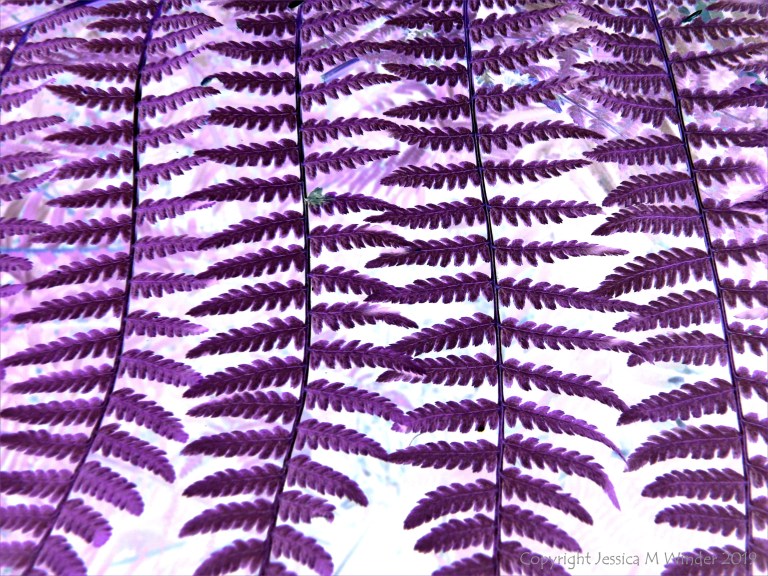
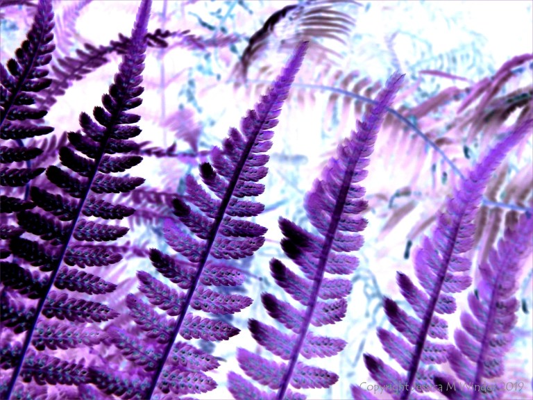
I’m probably too purist but I have misgivings about these ‘in post’ effects. I keep wondering if these coloured shots would be better natural?
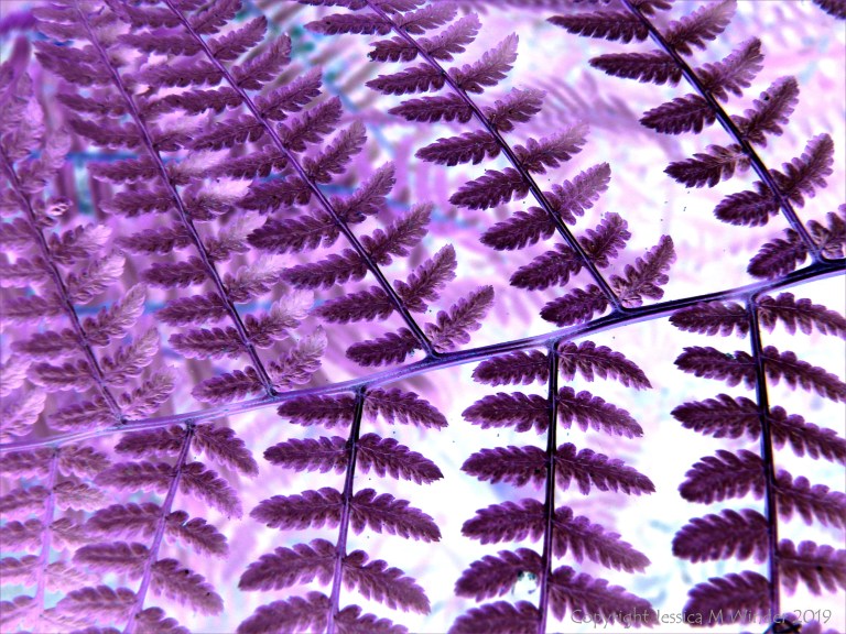
These ferns have wonderful graphic qualities and I suspect they’d look great in b/w. Perhaps you’re bored of just producing great un-retouched graphic semi-abstract photographs, but this fan never tires of them!
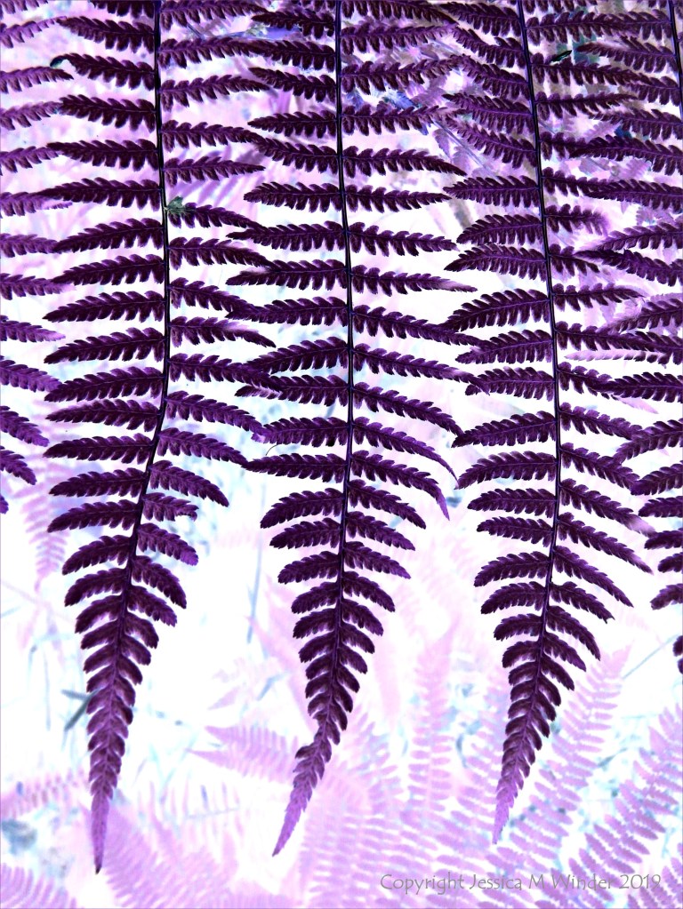
Thanks, Hamish. The next post to appear is in response to your comments. You are right to a certain extent that sometimes I prefer to add colour so that images are more colourful – I do think that you can have too many green leaves, too much yellow sand, too much blue water.


I’m probably too purist but I have misgivings about these ‘in post’ effects. I keep wondering if these coloured shots would be better natural?
These ferns have wonderful graphic qualities and I suspect they’d look great in b/w. Perhaps you’re bored of just producing great un-retouched graphic semi-abstract photographs, but this fan never tires of them!
LikeLiked by 1 person
So beautiful!😊
LikeLiked by 1 person
Thank you, John.
LikeLiked by 1 person
Thanks, Hamish. The next post to appear is in response to your comments. You are right to a certain extent that sometimes I prefer to add colour so that images are more colourful – I do think that you can have too many green leaves, too much yellow sand, too much blue water.
LikeLike
I think these purple ferns are awesome, Jessica.
LikeLiked by 1 person
Thank you, Emma.
LikeLiked by 1 person